
Responsive Mobile Design
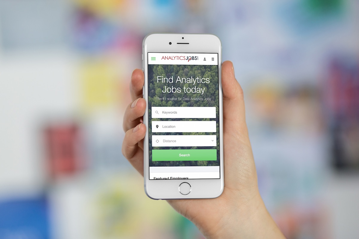
Mobile & Tablet friendly out of the gate. No separate app to worry about – our software uses the latest techniques to automatically resize for whatever screen size your audience visits on.
Mobile is the future of the web. As more and more people begin to use mobile devices, such as smartphones and tablets, tasks which used to be focused on the desktop are now fully mobile.
 Because mobile internet usage is increasing, it is critical that your job board works on mobile devices and the desktop and works and looks the same on both.
This is called responsive design and means that if a candidate visits your website on a desktop, mobile or tablet, they’ll see the same information but resized to fit on the smaller screen.
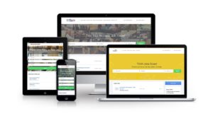
Because mobile internet usage is increasing, it is critical that your job board works on mobile devices and the desktop and works and looks the same on both.
This is called responsive design and means that if a candidate visits your website on a desktop, mobile or tablet, they’ll see the same information but resized to fit on the smaller screen.
In November 2014, the U.S. digital population spent 574 billion minutes using their smartphones, representing a 29 percent growth compared to December 2013, compared to just 510 billion minutes on desktop.Using JobBoard.io, your job board automatically looks great on mobile, web, tablets and more, giving the best possible candidate experience on all devices. JobBoard.io makes it easy for candidates to search, browse and apply on mobiles or desktops and makes it easy for employers to purchase listings on the move. Being mobile optimized is now a ranking factor for search engines – rest assured we have you covered!